

Learn how to create a dynamic chart in Excel with this complete 2025 guide. Discover easy methods using tables, slicers, named ranges, PivotCharts, and form controls to build smart, interactive charts that update automatically. Perfect for reports, dashboards, and data analysis.
Excel charts are great for showing data, but regular charts can quickly become outdated. That’s where dynamic charts come in. They can change on their own when your data changes or when someone interacts with them. This complete guide will help you go from making basic charts to building smart, interactive ones.
Dynamic charts save you time, look more professional, and help people make better decisions. Whether you’re making reports, tracking sales, or showing trends, these charts will make your work stand out.
Must Read: How Can Excel Improve Productivity: The Ultimate Guide to Transforming Your Work Efficiency in 2025
Understanding Dynamic Charts and Their Benefits
What Makes a Chart Dynamic?
A dynamic chart changes automatically without you having to fix it each time. These charts can:
- Update by themselves when you add new data
- React to filters when users make choices
- Change right away when the data changes
- Use colors that adjust based on values
- Offer different views that users can control
Regular charts show fixed data. Dynamic charts respond to changes or actions, turning your charts into tools people can interact with.
Why Dynamic Charts Are Essential for Modern Excel Users
Dynamic charts help in many ways:
- Better decisions by letting people look at the data in different ways
- Save time by updating on their own so you don’t have to
- Look professional and make your reports stand out
- Fewer mistakes because there’s no need to update things by hand
- Save money by replacing pricey tools with Excel
- Grow with your data without starting over
If you often work with data that changes, dynamic charts are a smart choice.
Essential Prerequisites for Dynamic Chart Creation
Data Structure Requirements
Your data must be neat to make dynamic charts work well:
- Use a table format with no merged cells, and keep each column the same type
- Have clear headers for each column to help with filters and formulas
- Keep formats the same, like using the same way to write dates and numbers
- Fix problems like missing values or duplicates
- Group related data in a way that makes sense
Keeping your data clean helps your dynamic charts run smoothly.
Excel Skills and Settings
To make dynamic charts, you should know how to:
- Make and change charts in Excel
- Use cell references like absolute ($A$1) and relative (A1)
- Turn on the Developer tab by going to File > Options > Customize Ribbon > Developer
- Name ranges to make formulas easier to read
- Use functions like INDEX, MATCH, OFFSET, COUNTA
- Work with tables that can grow with your data
These skills are the building blocks for making smart, interactive charts.
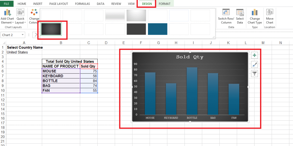
Method 1: Excel Tables and Slicers
Creating Dynamic Charts with Excel Tables
Excel Tables (use Ctrl+T) are an easy way to make dynamic charts. They offer:
- Auto-growth so charts always show all the data
- Simple formulas using clear names
- Nice formatting that looks good
- Charts that adjust when your table changes
- Easy updates—just add data, and the chart updates too
To use this, select your data, press Ctrl+T or go to Insert > Table, check “My table has headers,” and then make your chart from the table. It will update on its own as your data grows.
Implementing Slicers for Interactive Filtering
Slicers turn your chart into something users can interact with:
- Clickable buttons for easy filtering
- Pick more than one option with Ctrl+click
- Control many charts with one slicer
- Customize the look to match your dashboard
- See what’s filtered and reset quickly
- Easy for anyone to use, no special skills needed
To add a slicer, click your chart or table, go to Table Design > Insert Slicer, and pick the fields you want to filter, like Region or Date.
Method 2: Named Ranges with Dynamic Functions
Understanding OFFSET and Dynamic Range Creation
OFFSET makes charts update by using flexible data ranges:
- Resize automatically with OFFSET formulas
- Grow with your data like this:
=OFFSET(Sheet1!$A$2,0,0,COUNTA(Sheet1!$A:$A)-1,1) - Use named ranges like “Chart_Dates” for clear formulas
- Be careful because OFFSET is slow in big files
- Check your ranges often to avoid mistakes
- Manage easily in the Name Manager
This method gives you more control over which data your chart shows, especially as your data changes.
Advanced INDEX and MATCH Techniques
INDEX and MATCH help get data from certain places in your table:
- Find exact data using row and column numbers
- Look things up based on values in other cells
- Use more than one condition for complex lookups
- Avoid errors with IFERROR or IF(ISERROR())
- Work faster than OFFSET in large datasets
- Handle big data when your charts need detailed filtering
These are great when your chart needs to change based on user input or other data changes.
Method 3: PivotTables and PivotCharts
Creating Interactive PivotChart Dashboards
PivotCharts help show big sets of data in a simple way:
- Sum up data into easy charts
- Change fields to see different views
- Zoom in for more detail
- Update instantly when data changes
- Use built-in filters on the chart
- Work with related data from different tables
Start by creating a PivotTable (Insert > PivotTable), add fields, then go to PivotTable Analyze > PivotChart to make the chart.
Enhancing PivotCharts with Slicers and Timelines
Make PivotCharts even better with extra tools:
- Add slicers for easier filtering
- Use timelines to pick dates visually
- Connect multiple charts to one slicer
- Keep dashboards in sync with shared filters
- Place slicers well to make dashboards easy to use
- Style slicers to match your report design
Timelines are great for selecting months, quarters, or years with just a few clicks.
Method 4: Form Controls for Advanced Interactivity
Implementing Dropdown Controls
Form controls let you create custom tools for your charts:
- Add dropdowns from the Developer tab > Insert > Form Controls
- Link to a list of options in your worksheet
- Connect to a cell that shows the selected choice
- Use INDEX to pull data based on the dropdown
- Combine controls for more complex dashboards
- Make them look good and easy to use
Set up your dropdowns by choosing the input range (the list) and the linked cell (where the choice shows up). Then use that choice in a formula to update your chart.
Advanced Control Integration
Use more controls to make your charts really powerful:
- Scroll bars or spin buttons to pick numbers like date ranges
- Option buttons to pick one choice from a group
- Check boxes to turn data series on or off
- Mix controls to give users more power
- Use VBA if you want custom features
- Plan ahead to avoid control mix-ups
These tools help you build dashboards that work like professional software.
Best Practices and Optimization
Performance and Maintenance
To keep dynamic charts running fast and smooth:
- Separate raw data from formulas
- Use clear names for ranges and update them as needed
- Avoid too many volatile formulas like OFFSET
- Test everything to make sure controls work
- Write things down so others know how it works
- Update regularly to keep links and data fresh
Good setup helps your charts run fast, even with lots of data.
Troubleshooting Common Issues
If your chart isn’t working, try these fixes:
- #REF! errors mean something is broken—check ranges
- Chart not updating? Check your data links
- Slow chart? Try faster formulas
- Wrong data type? Make sure formats match
- Slicer not working? Check table connections
- Controls acting weird? Make sure links and ranges are correct
Go step by step to find and fix problems, so your charts stay reliable.
Must Read: Can Excel Help in Personal Budgeting? The Complete Guide for 2025
Conclusion
Dynamic charts turn Excel into an interactive tool for exploring data and making smart choices. If you learn these four methods—Excel Tables with Slicers, Named Ranges with Functions, PivotTables with PivotCharts, and Form Controls—you’ll be able to build dashboards that are useful, professional, and impressive.
Start simple with tables and slicers, then move on to more advanced tools as you grow. Each method helps in different ways, whether you’re filtering data or building custom dashboards. Learning how to make dynamic charts saves time, reduces mistakes, and helps you create reports that people will trust and enjoy.
Practice with different kinds of data and charts. With time, you’ll become an Excel expert who can build powerful charts that help people understand and use their data better.
